Table of Contents
Introduction to Figma and Showit
Figma has revolutionized the design process, allowing designers to create interactive mockups that can be shared effortlessly with clients and developers. When it comes to building websites, Showit offers an incredibly flexible platform that marries design creativity with the power of WordPress. In this article, we will explore how to convert your Figma designs into stunning Showit websites, discussing essential settings, mobile-first design principles, and styling for your WordPress blog.
Preparing Your Figma Design
Before diving into the Showit platform, it's crucial to ensure that your Figma design is optimized for web development. Here are some steps to consider:
- Use consistent styles for typography and colors to streamline the process.
- Export assets such as images and icons in appropriate formats (SVG, PNG, JPEG).
- Organize layers and frames logically to reflect the structure of your future Showit site.
Setting Up Showit
After exporting your assets from Figma, it’s time to set up your Showit account. If you haven’t done this yet, follow these steps:
- Visit the Showit website and sign up for an account.
- Choose a template that closely resembles your Figma design to reduce the amount of customization needed.
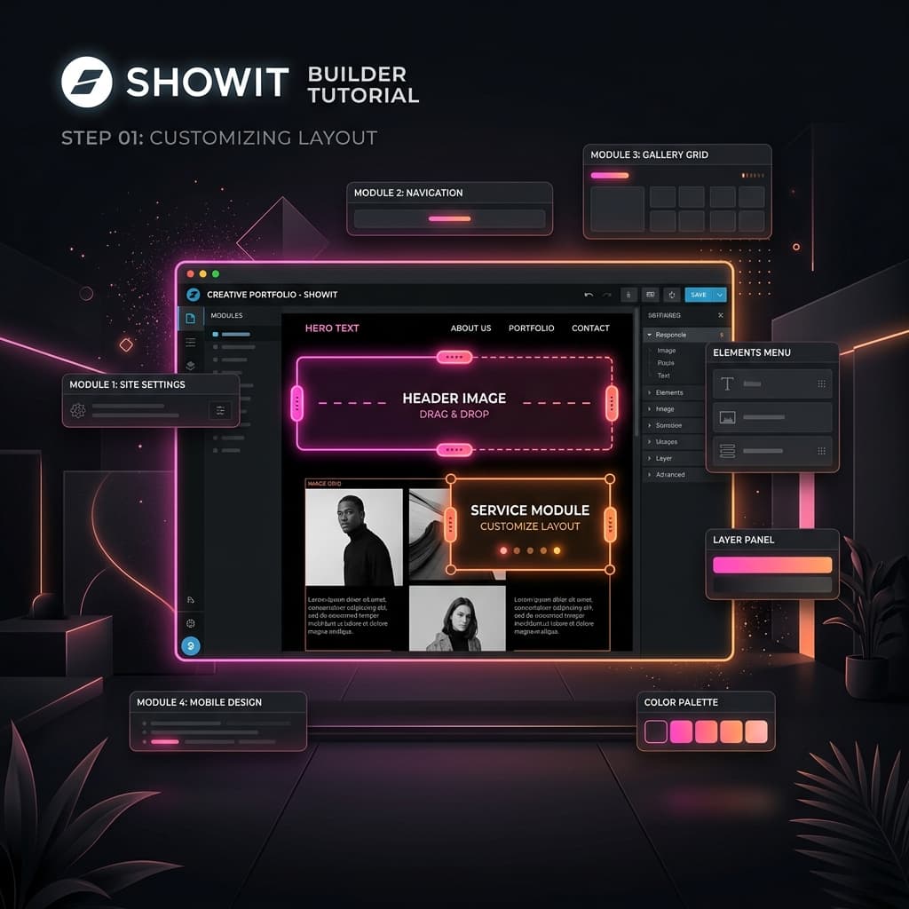
- Open the Showit app and familiarize yourself with the drag-and-drop interface.
Custom Canvas Settings
To effectively translate your Figma design into Showit, you need to adjust the custom canvas settings. This is vital for ensuring your design scales well on different devices.
- Set the canvas width to match your Figma frame size, commonly 1440px for desktop.
- Enable 'Responsive' settings to manage how elements rearrange on smaller screens.
- Consider creating multiple canvases for different screen sizes (desktop, tablet, mobile) to maintain design integrity.
Importing Assets from Figma to Showit
With your canvas setup, the next step is to import the assets you exported from Figma. Here’s how to do it:
- In Showit, click on the 'Media' tab and upload your exported images.
- Drag and drop images onto your canvas from the media library.
- Use the 'Add' button to create text boxes and input the typography styles you defined in Figma.
Mobile-First Design in Showit
Showit’s drag-and-drop interface allows for a mobile-first approach, which is crucial in today’s web development landscape. Here are practical tips for achieving this:
- Design your mobile layout first, ensuring elements are stacked and readable.
- Utilize Showit's mobile preview feature to test responsiveness as you build.
- Adjust font sizes and spacing specifically for mobile views to enhance usability.
Styling Your WordPress Blog
Showit seamlessly integrates with WordPress, allowing you to manage a blog alongside your custom-designed pages. To style your WordPress blog to match your design:
- Access the WordPress dashboard and navigate to 'Appearance' > 'Customize'.
- Choose typography and colors that align with your overall site design.
- Use Showit’s settings to adjust blog layouts, ensuring they are consistent with your Figma mockups.
Final Adjustments and Publishing
After importing all your assets and styling your blog, it’s time to make final adjustments before publishing. Consider the following:
- Double-check all links and buttons to ensure they lead to the correct pages.
- Test your website across different devices and browsers for compatibility.
- Preview your site in Showit’s preview mode to catch any last-minute design issues.
Conclusion
Transforming your Figma designs into Showit websites can be an exciting process that enhances your workflow and showcases your creativity. By following the steps outlined in this article, you can create visually stunning, responsive websites that captivate your audience. Embrace the versatility of Showit and leverage your design skills to bring your visions to life.
Related Articles
How to Convert Figma to Elementor WordPress — Complete Guide 2026
Learn the complete step-by-step process for converting Figma designs into pixel-perfect WordPress Elementor websites. Covers design audits, asset optimizations, containers, and QA.
Next.jsFrom Figma to Next.js: Turn Your Design Into a Lightning-Fast React Website
Learn how to build high-performance React web applications using Next.js App Router. Covers styling custom components with Tailwind CSS, APIs, and Vercel hosting.