Table of Contents
- Mistake #1: Ignoring Auto Layout and Just Eyeballing Everything
- Mistake #2: Exporting Images the Wrong Way
- Mistake #3: Hardcoding Pixel Widths Instead of Using Percentages
- Mistake #4: Treating Typography as Random Numbers
- Mistake #5: Never Testing on an Actual WordPress Site
- The Common Thread: Figma and Elementor Speak Different Languages
- Start Converting the Right Way
You've just finished a Figma design that makes you genuinely proud. The colors are right. The spacing is tight. The client signed off with a thumbs-up emoji and everything. Then you open WordPress, fire up Elementor, and start rebuilding it — and somehow, what comes out the other side looks like a distant cousin of the original.
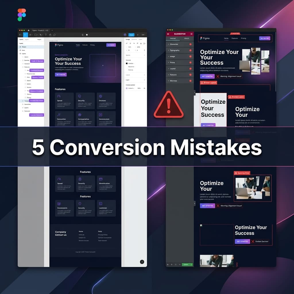
If that sounds painfully familiar, you're not alone. The figma to elementor conversion process is where beautiful designs go to get quietly mangled. Not because Elementor is bad — it's a powerful builder. The problem is that Figma and Elementor think about layouts in fundamentally different ways, and if you don't account for those differences, you end up with a site that looks 'close enough' on desktop and completely falls apart on mobile.
I've reviewed hundreds of figma to elementor conversions over the years, and the same five mistakes show up over and over. The worst part? Most of them are invisible until someone visits on a phone, or until Google's Core Web Vitals tanks your ranking. Let's fix that.
Mistake #1: Ignoring Auto Layout and Just Eyeballing Everything
This is the big one. In Figma, Auto Layout is the backbone of how elements flow and resize. It defines direction (horizontal or vertical), gaps between elements, padding inside frames, and how children behave when the parent stretches. When you convert a figma design to elementor, Auto Layout maps almost perfectly to Elementor's Flexbox Containers.
But here's what actually happens: most people ignore the Auto Layout values entirely. They look at the design, drag a widget into Elementor, and use their eyes to position things 'about right.' They set fixed pixel margins. They nudge things around until the desktop preview looks correct.
The result? A layout that's basically a house of cards. It looks fine at exactly 1440px wide and collapses at every other screen size. The fix is simple but requires discipline: when you see a Figma frame with Auto Layout set to 'horizontal, gap 24, padding 48 32,' translate that literally into Elementor. Set the container to Flexbox Row, gap 24px, padding 48px 32px. Don't eyeball it.
Auto Layout in Figma = Flexbox Container in Elementor. If you're not mapping these 1:1, you're building on sand.
Mistake #2: Exporting Images the Wrong Way
Every figma to elementor workflow involves exporting images. And every week, I see someone export a hero banner as a 4MB PNG and drop it straight into WordPress. The page loads in six seconds. The client blames the hosting. Nobody's happy.
The image export step is where most conversion speed issues originate. Here's a quick cheat sheet for getting it right:
- Photos and complex images → Export as WebP at 80% quality (not PNG). You'll save 60-80% file size with zero visible quality loss.
- Icons and simple illustrations → Export as SVG. They scale infinitely and weigh almost nothing.
- Background textures and gradients → Consider recreating them in CSS inside Elementor instead of using an image at all.
- Always export at 2x resolution if you're using raster formats — retina screens are everywhere now.
- Use WordPress's built-in image compression or a plugin like ShortPixel to auto-optimize on upload.
One more thing people miss: Figma's 'Export' panel lets you batch export every image in your design at once. Select the parent frame, add an export setting, and hit export. Don't screenshot individual layers — that's how you end up with inconsistent resolutions and transparent edges getting flattened.
Mistake #3: Hardcoding Pixel Widths Instead of Using Percentages
Figma designs are typically created at a fixed width — 1440px for desktop, 375px for mobile. This is fine for designing. But when people convert figma to elementor, they often carry those fixed widths straight into the builder. A column becomes 'width: 680px' instead of 'width: 47%.' A card becomes 'width: 340px' instead of sitting inside a grid that handles sizing automatically.
Fixed widths are the enemy of responsive design. They work at one breakpoint and cause horizontal scrolling or awkward gaps at every other size. Elementor's strength is its responsive percentage-based system — columns within a section naturally resize based on the viewport.
The rule of thumb: use percentages for widths, rem or em for typography, and px only for things that should genuinely stay fixed (like border widths or icon sizes). When you see a Figma frame that's 680px out of 1440px, that's roughly 47%. Translate it as a percentage.
This sounds basic, but I'd estimate this single mistake causes about 40% of the 'my site looks broken on tablet' support tickets I've seen.
Mistake #4: Treating Typography as Random Numbers
Designers love typography. In Figma, you might use 13px for captions, 15px for body text, 18px for subtitles, 22px for small headings, 36px for section titles, and 64px for the hero. That's six different sizes, and they probably look great together.
The problem comes when you try to recreate these in Elementor. If you set each text widget's font size individually — manually typing 13, 15, 18, 22, 36, 64 into separate widgets — you've created a maintenance nightmare. Change the body font size later? You'll need to find and update every single widget.
The right approach for a figma to elementor conversion is to set up a typography system in Elementor's Global Styles first. Before you build a single section, go to Site Settings → Global Fonts and define your scale: Primary (headings), Secondary (subheadings), Text (body), and Accent (buttons/labels). Then when building, select the global style instead of typing raw pixel values.
Bonus: Google Fonts mapping matters too. If your Figma design uses 'DM Sans' but you forget to load it in WordPress, the browser falls back to Arial or Helvetica and suddenly your elegant design looks like a 2008 corporate website. Always verify font loading.
Mistake #5: Never Testing on an Actual WordPress Site
This might sound obvious, but the number of people who build entire Elementor pages without ever viewing the actual frontend is staggering. They work exclusively inside the Elementor editor, which is a reasonable approximation of the live site — but only an approximation.
The Elementor editor doesn't show you your theme's header and footer. It doesn't show plugin-injected elements. It doesn't show how your page behaves with real browser scrolling, real font loading delays, or real image lazy-loading. You need to hit 'Publish' (or 'Preview') and look at the actual page in a real browser.
Here's my testing checklist after every figma to elementor conversion:
- Open the live page in Chrome, Safari, and Firefox — they render Flexbox slightly differently.
- Resize the browser slowly from 1920px down to 320px and watch for layout breaks.
- Check the page on an actual phone (not just browser DevTools). Touch targets, font sizes, and scroll behavior feel different on real hardware.
- Run Google PageSpeed Insights. If your score drops below 80 on mobile, investigate image sizes and unused CSS first.
- Check that all links, buttons, and forms actually work — the editor doesn't always show broken hrefs.
The Common Thread: Figma and Elementor Speak Different Languages
All five of these mistakes share the same root cause: Figma is a design tool that deals in visual precision, and Elementor is a web builder that deals in browser rendering. The gap between 'looks right in Figma' and 'works right in a browser' is where conversion quality lives.
Closing that gap manually takes experience, discipline, and a lot of cross-referencing. That's exactly why we built Figmantor — an AI-powered Figma plugin that reads your design's actual Auto Layout, spacing, colors, and typography values, and translates them directly into Elementor-compatible JSON. No eyeballing. No pixel-width guessing. No font mismatches.
It doesn't replace a developer — you still need human judgment for interactions, animations, and complex logic. But for the structural conversion? It eliminates the five mistakes above by default, because it reads the data instead of interpreting a screenshot.
Start Converting the Right Way
Whether you use Figmantor or do it manually, the key takeaway is this: treat your figma to elementor conversion as a translation project, not a recreation project. You're not rebuilding the design from memory — you're translating specific values from one system to another. Auto Layout → Flexbox. Design tokens → Global Styles. Frame widths → percentages. When you think about it that way, the quality gap disappears.
If you want help with your next conversion, or you're stuck on a layout that won't cooperate, reach out to our team on WhatsApp. We've done this hundreds of times and we're happy to take a look.
Related Articles
How to Convert Figma to Elementor WordPress — Complete Guide 2026
Learn the complete step-by-step process for converting Figma designs into pixel-perfect WordPress Elementor websites. Covers design audits, asset optimizations, containers, and QA.
ShowitFigma to Showit: Build Stunning Showit Websites From Your Designs
Discover how to transform your Figma mockups into beautiful, drag-and-drop Showit websites. Learn the custom canvas settings, mobile-first design, and WordPress blog styling.